What is a user interface?
A user interface (UI) is the point of interaction between a user and a digital product, such as a website, application or software. It’s the space where humans and technology meet, consisting of all the elements — buttons, icons, menus, and visual layout — that users engage with to complete tasks or find information.
UI focuses on designing these elements to be intuitive and user-friendly. According to a study by Forrester Research, a well-designed user interface can increase website conversion rates by up to 200%. So, it’s all about creating a seamless path for users to follow, where every click, scroll and swipe feels natural.
Understanding UI involves recognizing its critical components, such as:
- Typography
- Color schemes
- Interactive elements
- Visual hierarchy
All these elements work together to guide users through their journey. As digital workplaces evolve, knowing what makes a great UI can be the key to crafting a more effective and engaging experience for your employees.

Importance of a good user interface
A good user interface is more about the functionality that directly contributes to a more engaged, efficient and satisfied workforce. Here’s why investing in a good UI is critical:
- Boosts employee engagement: A clean, intuitive interface encourages employees to use the platform more frequently, ensuring better communication and collaboration across teams.
- Reduces training time: When the UI is easy to understand, your team spends less time learning how to use it and more time getting work done.
- Minimizes errors: A well-designed UI minimizes confusion, helping to prevent mistakes and reduce support requests, which can be costly and time-consuming.
- Enhances productivity: Employees navigate tools faster and with greater ease, allowing them to focus on their tasks rather than figuring out how to use the software.
- Improves accessibility: An inclusive UI ensures that everyone, regardless of ability, can effectively use the platform, creating a more inclusive workplace environment.
Types of user interfaces
User interfaces come in various forms, each designed to serve different user needs and preferences. Understanding the main types of UIs can help you choose the best fit for your organization’s digital tools.
Graphical user interface (GUI)
A graphical user interface (GUI) uses visual elements like icons, buttons, and menus to help users interact with digital systems. You see GUIs everywhere — from your desktop computer to your smartphone apps.
GUIs are designed to be intuitive, reducing the learning curve and making technology accessible to a broader audience. With drag-and-drop features, point-and-click navigation and a visually appealing design, GUIs simplify complex tasks and enhance overall user satisfaction.
Command-line interface (CLI)
A command-line interface (CLI) is all about text commands. Unlike GUIs, which rely on visuals, CLIs require users to type specific commands to perform tasks. While this may seem outdated, CLIs are still popular among IT professionals and developers because they offer speed and precision.
A well-versed user can execute commands faster through a CLI than navigating multiple GUI menus. If you manage a technical team, you might find that CLIs offer the control and flexibility they need for complex tasks.
Voice user interface (VUI)
Voice user interfaces (VUIs) have surged in popularity with the rise of smart speakers and virtual assistants like Amazon Alexa and Google Assistant. Instead of relying on visual or text-based elements, VUIs allow users to interact with technology through voice commands.
For organizations looking to enhance accessibility or provide hands-free options, VUIs can be a game-changer. They offer a more natural and intuitive way to interact with devices, making digital tools more inclusive and easier to use for everyone.
History of user interface
User interfaces have come a long way since the early days of computing. In the 1960s, UI was primarily command-line based, requiring users to input text commands — a far cry from today’s intuitive designs. This approach was functional for tech professionals but created a significant barrier for everyday users.
Things began to change in the 1980s when Xerox introduced the first graphical user interface (GUI), using icons and visual elements instead of text commands. This innovation paved the way for more user-friendly computing and was later popularized by Apple and Microsoft, fundamentally changing how people interacted with technology.
Over the next few decades, UIs continued to evolve rapidly. The introduction of the web in the 1990s brought about a new wave of design focused on accessibility and visual appeal, driving the need for more intuitive and engaging interfaces.
With the rise of mobile devices in the 2000s, user interfaces had to adapt once again to fit smaller screens and touch interactions, leading to the birth of mobile-first design principles and responsive layouts.
Today, UIs are incorporating artificial intelligence and voice commands, aiming to deliver personalized and seamless experiences for users across various platforms.
Important elements of a user interface
A good user interface is built from several core elements, each playing a unique role in creating a seamless experience.
Buttons
Buttons guide users to take specific actions, like submitting a form or navigating to another page. To be effective, buttons should be clearly labeled, visually distinct and easy to find. A well-designed button stands out without overwhelming the page, providing users with a clear path forward.
Menus
Menus organize content and options in a structured way, helping users find what they need quickly. Whether it’s a drop-down menu or a sidebar, the goal is to create a logical flow that reduces confusion. Good menu design is intuitive and consistent, making it easier for users to navigate the platform and complete their tasks efficiently.
Icons
Icons serve as visual shortcuts, representing actions, files or tools with simple graphics. A well-designed icon communicates meaning without the need for words, enhancing usability and saving space on the screen. When used correctly, icons add visual interest and help users quickly understand their options, improving overall navigation.
Layouts
Layouts determine where each element — buttons, menus, icons and text — appears on the screen. A good layout creates a visual hierarchy, guiding users’ eyes to the most important information first. It balances aesthetics with functionality, ensuring that the interface is both attractive and easy to use. An effective layout reduces cognitive load, helping users find what they need without frustration.
UI vs. UX: What’s the difference?
User interface (UI) and User experience (UX) are often used interchangeably, but they focus on different aspects of a digital product. UI is all about what users see and interact with. A great UI makes your platform visually appealing and easy to navigate, but it’s just one part of the puzzle.
UX, on the other hand, is about the entire experience a user has while interacting with your product. It considers the user’s journey from start to finish, focusing on how intuitive, enjoyable and efficient the process is. While UI is concerned with aesthetics and layout, UX delves into usability, accessibility and user satisfaction.
| Aspect | UI (User interface) | UX (User experience) |
| Focus | Visual elements, design, and aesthetics | Overall experience, usability, and satisfaction |
| Purpose | Makes the interface visually appealing and easy to use | Ensures the product is easy, efficient, and enjoyable to use |
| Key elements | Colors, buttons, icons, typography, and layout | User research, testing, navigation flow, and content strategy |
| Outcome | Attractive and accessible interface | Seamless, engaging, and intuitive user journey |
The role of UI in digital products
User Interface (UI) plays a pivotal role in shaping how users perceive and interact with digital products. Whether it’s a website, mobile app or software application, a well-designed UI makes your product intuitive, engaging and accessible. Let’s break down how UI works in different digital contexts.
UI in websites
On websites, UI is crucial for capturing and holding the user’s attention. Your website’s design elements — like navigation menus, buttons, icons and typography — should guide users effortlessly to the information they need.
A clear and engaging UI ensures users spend more time on your site, reducing bounce rates and increasing conversions. Every element should be strategically placed to make navigation smooth, keeping the user journey seamless and satisfying.
UI in mobile apps
In mobile apps, UI must be responsive and easy to use on smaller screens. Given the limited screen space, every button, icon and gesture needs to be optimized for touch interaction.
A great mobile UI prioritizes simplicity and speed, providing users with quick access to key features. You need to consider factors like thumb reachability, minimalistic design and visual feedback to ensure a fluid and enjoyable experience for your users.
UI in software applications
For software applications, UI is about balancing complexity with usability. These products often have more features and functionality, which means your UI needs to be well-organized and intuitive.
Clear icons, logical navigation and consistent design patterns help users understand and efficiently use the software. A thoughtful UI minimizes the learning curve, enabling users to get up to speed quickly and perform tasks without frustration.
UI in intranets
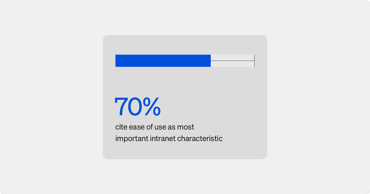
A well-designed intranet interface facilitates ease of use, making it simple for employees to access important resources and communicate with colleagues. When the UI is intuitive and visually appealing, employees are more likely to engage with the platform regularly, leading to higher adoption rates and better overall utilization of internal tools.

Features like customizable dashboards, easy-to-navigate menus and engaging visual elements help employees feel more connected and informed. With a user-friendly design, employees can quickly find the information and tools they need, minimizing frustration and maximizing their efficiency. Simpplr’s modern intranet combines a sleek, intuitive UI with powerful functionality, seamlessly integrating into your organization’s daily operations and supporting smooth communication and collaboration across teams.

Conclusion
From websites and mobile apps to software applications and intranets, a thoughtfully crafted UI enhances user experience, engagement and efficiency. By focusing on clear, intuitive design elements like buttons, menus and icons, you can significantly improve how users interact with your platform.
For employees, a seamless UI is crucial for maximizing productivity and fostering a positive work environment. A well-designed intranet UI can simplify daily tasks, improve communication and facilitate collaboration, making it a vital tool for any organization. Simpplr’s modern intranet offers a user-friendly experience that enhances communication and collaboration across teams. To see how Simpplr can transform your intranet experience, watch our quick demo and discover the benefits for yourself.


