With Simpplr, we set out to build the world’s easiest employee intranet”; an employee communication platform that is easy to use, simple, beautiful, intuitive and personalized – and of course, seamlessly connected to your daily workspace.
We want to delight the user; in some sense injecting a sense of excitement and passion in the user experience – the sort that we only see happening with consumer apps, and largely missing in enterprise application design. This obsession with “delight” often provides us with a sense of direction while we evaluate some of the important choices we make at Simpplr. From the very beginning, Simpplr has been design-led, where form usually trumps function (read: features in the enterprise world). With Simpplr, we have set out to transform the enterprise UX with addictive, consumer-centric design patterns and experiences, while ensuring security, scalability and extensibility of the underlying application platform.
Facebook was launched in 2004 and the iPhone in 2007, and since then a lot has changed in the way we communicate, collaborate, and share using social networks. A furious pace of innovation leveraging cloud, mobile and social has since altered the broad spectrum of user experience in fundamental ways; the likes of LinkedIn, Twitter, Google+, Skype, WhatsApp, Tumblr and Instagram represent paradigms of modern communication and engagement.
However, when we look at employee communication and workplace applications, user experiences are yet untouched by this spate of innovation sweeping the consumer world. It would not be much of a stretch to describe LinkedIn as the most dynamic platform for business engagement and social discovery, even within the bounds of a specific company. Existing employee communication platforms, mostly styled as intranets, and in some reincarnations as social intranets, are mostly static document repositories behind static home pages that were designed a long, long time ago.
By now, corporate intranets have been around for more than two decades. Over time, they have morphed into complex and inflexible content management systems driven by top-down information architectures that do not allow ubiquitous flow of user-generated content – the lifeblood of social platforms that power the consumer world.
Building a custom intranet is an onerous task that few companies have the continued energy to redefine and reengineer for business groups across the enterprise. If we start building and maintaining customized versions of Facebook and LinkedIn, they would soon start looking like most company intranets; preserved fossils from bygone eras.
So, what was missing? How did we design Simpplr to usher in new, improved rules of social engagement for the enterprise?
To begin with, we knew we had to separate form from function at the highest level to be able to innovate at the level of design and user experience. Simpplr had to be built on top of a world-class enterprise Social Cloud platform, which brings us back to where we started. We wanted to delight the user and not worry too much about the capability of the underlying platform so we could prioritize the user experience.
We really did not want to build social APIs, mobile-first architectures, identity and access management, web services and integration APIs, etc. The other critical requirement for us was an underlying data architecture that provides the ability for internal members (employees) to connect with external communities and members (prospects, customers, partners and group entities). In other words, we wanted a Cloud CRM.
This is what led us to Salesforce1 and Chatter as the enterprise layer of choice.
Much of what Simpplr does today constructs a beautiful and seamless employee communication layer with Salesforce Chatter as the underlying API engine.
In subsequent blog posts we will share details of the design choices that we make, with respect to specific Simpplr functions and workflows. The following are some of the important decisions we have made so far:
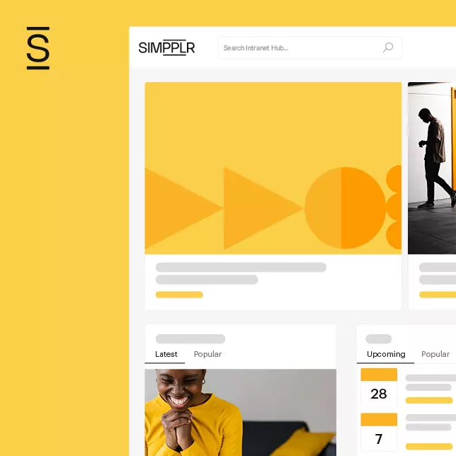
- We wanted to implement some key universals. A clean, white background with tastefully designed content spaces and actions provides a set-up that can easily align with all brands, without the need to include custom colors and images. Once you have uploaded your company logo, you are pretty much ready to roll.
- Familiar consumer-app interfaces that all of us now take for granted. A modern two-level menu makes it easy for users to find whatever they are looking for, with minimal clicks.
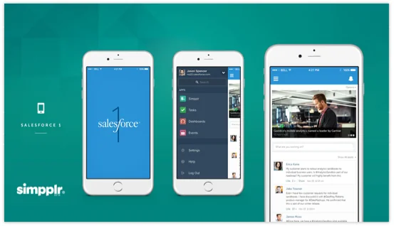
- Mobility will continue to be the dominant user theme that will drive compelling user workflow and engagement experiences. Simpplr is designed mobile-first, is completely responsive, and can be accessed from the Salesforce1 app.
- Layouts are easy to configure so that content inclusion, orientation and placement are simple and can be implemented via simple point-and-click actions.
- As a design choice, we have limited the extent of configurability to limit user choice, e.g. we restrict custom labeling. We want to avoid the proliferation of nomenclatures such as articles, resources and files, as well as photos and albums across sites and departments. Keep in mind – this is not your Content Management System (CMS)!
- Community spaces are simple to understand, representing groups, sites and projects. While groups facilitate unstructured interaction, sites provide richer repositories that include news, events, content libraries and media clips. Simpplr does not allow site hierarchies, with no nested sub-sites.
- Administering Simpplr is easy, requiring no technical expertise. There are three administrative roles to manage user profiles: the System Administrator has cross-application access and rights, the App Moderator has administrative access to all sites (excepting private sites), while Site Managers own and administer their specific sites.
Some of the areas we are currently working on include:
- An improved Events Page, making it more engaging and beautiful. We are expecting to release it by March 2015.
- We are also working on a more full-bodied calendar. We have finished the design, and will be releasing this within the next quarter.
We look forward to sharing our experiences with you as we work to make our social intranet truly delightful. If you have questions, comments or something you want to learn more about, please let us know.

