When we started Simpplr, we believed that everyone deserved a better experience at work. As we’ve pushed towards a better way, the world also has also been evolving. Expectations for employers and employees have transformed as work and life have changed. Our customers and their business models have evolved alongside the market. And as all sustainable organizations do, we also have evolved with the changing world.
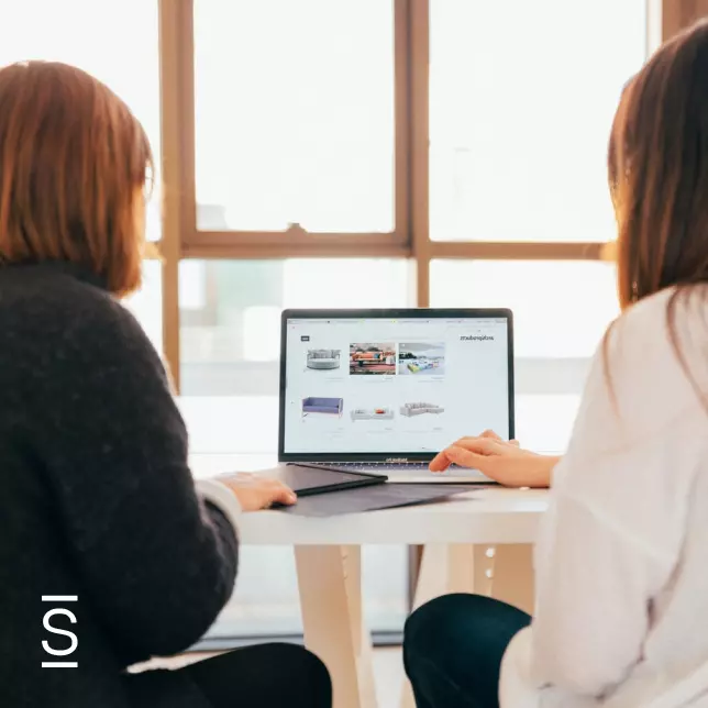
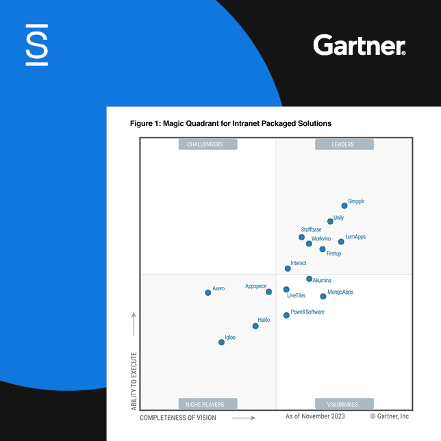
In the past 18 months, we’ve gone through a major transformation and growth, evolving from an intranet software company to a unified AI-powered employee experience platform company. We’ve focused on building a platform where employees can flourish, and feel connected, supported, and included.
Today, we’re introducing our first brand evolution since our beginning. Our new brand reflects the heart of why we do what we do every day — people. It represents how we’ve felt since our beginning eight years ago. It captures our mission to transform the work experience for billions of people across the world.
Meet our new logo.
Where people are at the center. Wherever people work, Simpplr enables them to flourish. Organizations use our forward-looking, adaptable solution to deliver personalized experiences that inspire and engage their people.

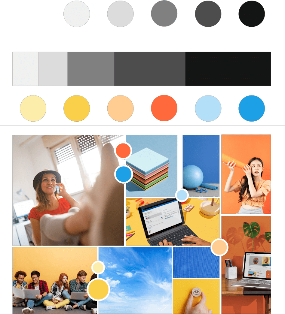
Color speaks all languages.
Our new color palette is a direct reflection of our personality. The solid, neutral framework of our primary brand colors represents simplicity. And the splashes of sun, tangerine, and sky liven up our brand and capture our commitment to optimism, care, and building trust. And, our new font, Söhne, mirrors the idea behind our brand: frictionless, easy, and effective.
Our design philosophy.
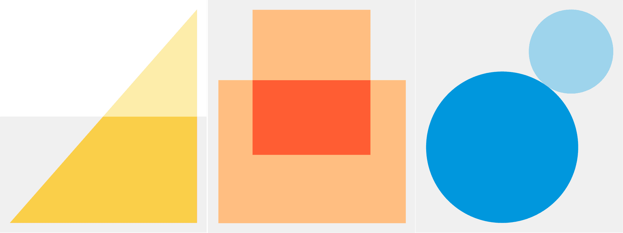
The Simpplr design system is driven by a singular philosophy: Create clarity through focus.
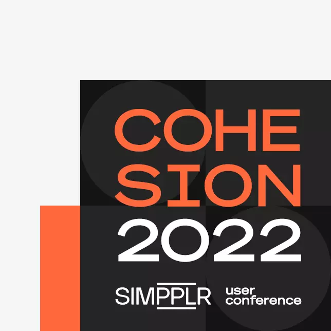
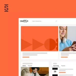
There are two elements you will see in our design work going forward. First, our graphic elements express connection and we use shapes to represent the breadth and diversity of the organizations and people we serve. Second, some may refer to it as blank space, we call it — open space. Why open space? Because we think the world of work is already cluttered enough and don’t want to add to the disorder. Instead, we designed open space into our design approach to signify how we think an employee experience platform should feel: simple, minimal, and uncluttered.
When work is good, life is better.
This refinement of our brand drives us further toward our belief that work shapes who we are, how we feel, and what we give to the world. A bad experience with work can cast a shadow on other parts of our lives. But a good experience can light things up. A good experience at work gets people excited, not just to work better but to live better. It inspires people to have stronger relationships, to spend time doing things they love, and to build vibrant communities and a healthier world.
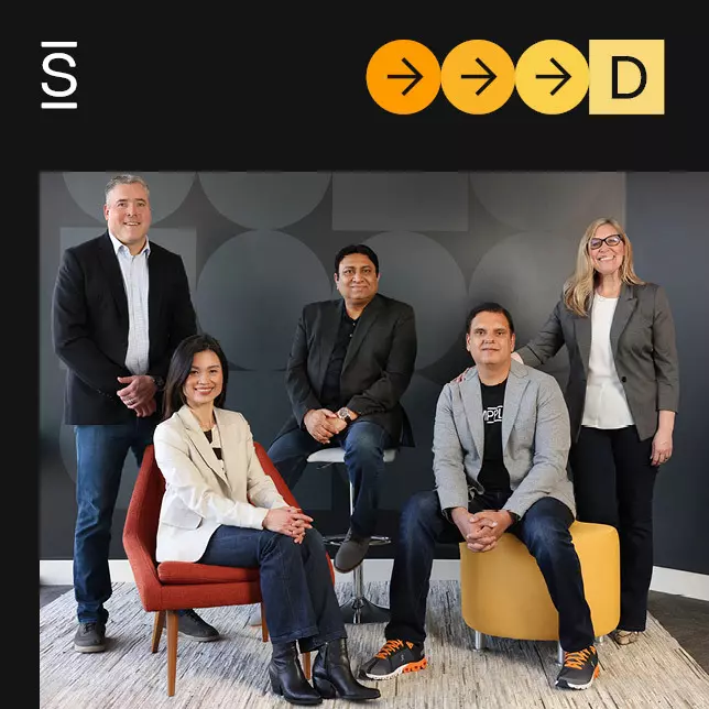
I am incredibly grateful for both the Simpplr team and our agency partners who worked tirelessly to get this right and make an impact.
Logos, colors, and fonts don’t make a brand. A truly generational brand is made up of the commitment and experiences that an organization provides to its employees and its customers. A truly great brand is predicated on a purpose. Our purpose is to inspire greatness in people so they can flourish in all parts of life. Organizations choose Simpplr so they can do the same.
