This is part four of our “Why intranets fail” series. Read parts one, two, three, five, six, seven, eight, nine, and 10.
Many organizations overlook the critical role that a well-designed user interface (UI) and ease of navigation play in the success of their intranet. Employees are accustomed to consumer-grade digital experiences in their personal lives, but the gap between personal and workplace technology has never been wider. This disconnect could be silently disengaging your workforce, lowering productivity, and damaging employee well-being.
Employees today expect smooth, seamless interactions with workplace systems, just as they do when shopping online or using social media. When they encounter a clunky, hard-to-navigate intranet, it slows them down, causing frustration and creating an unnecessary layer of friction in their workday.

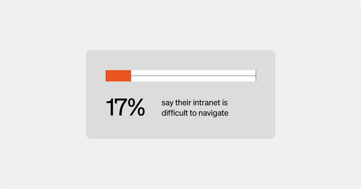
According to recent Simpplr research, 17% of senior intranet leaders noted that an inferior user interface contributed to the failure of their intranet programs, which in turn affects not only employee productivity but also well-being.
If the technology they rely on is clunky or ineffective, employees might feel their organization doesn’t prioritize necessary investments into technology to support their needs. This daily frustration compounds over time, impacting employee well-being and hurting engagement.
Let’s take a closer look at the consequences of poorly designed intranet UI, best practices for improvement, and the rewards for investing in sophisticated intranet technology.
The impact of clunky intranet UI on productivity
From a consumer sales perspective, a well-designed site can increase purchase conversions by 200%. Research also shows that 88% of online consumers are less likely to return to a website after a bad experience.
The same principle applies to your company intranet. As internal consumers of information, employees are far less likely to engage with a platform that feels outdated, confusing or inefficient. This disengagement can have a ripple effect, leading to missed updates, overlooked resources and underused tools that are valuable to their day-to-day tasks.
5x risk of negative employee engagement due to a poor employee technology experience
Employees waste valuable time dealing with the inefficiencies of a poorly designed intranet UI. When they have to contend with disorganized menus and outdated design, they spend more time troubleshooting than getting work done. Each instance of searching for documents, battling slow-loading pages, or sifting through convoluted menus adds up, creating a significant drag on productivity.
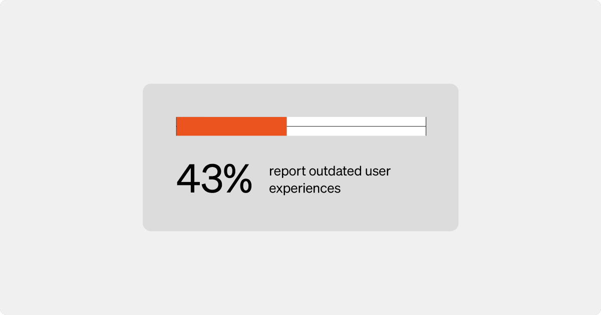
How a user-friendly intranet affects the employee experience
Our research showed that a better digital employee experience (EX) requires a user-friendly intranet that aligns with employees’ expectations for modern technology. A platform with an intuitive design empowers employees to do their best work without the friction of complicated intranet navigation.
When employees can easily access key information — whether it’s a critical HR update, a project management application, or an important company announcement — their efficiency and job satisfaction increase.
A well-designed intranet can significantly enhance employee productivity and well-being.
When technology works seamlessly, employees experience lower stress levels and a greater sense of optimism about their work. This is especially critical for frontline workers, who often feel disconnected from the larger organization.
A well-designed and easy to use intranet gives them quick access to the tools and information they need to stay informed and engaged, no matter where they work.
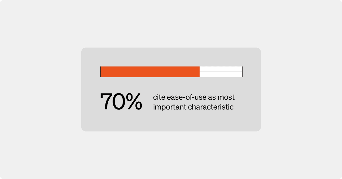
Learn more: How a modern intranet UI design improves EX and CX, and delivers ROI
Intranet navigation best practices to improve EX
Effective intranet navigation is essential for ensuring that employees can quickly and easily find the information they need. If employees have to navigate multiple layers to find a simple document or tool, their workflow is disrupted, creating frustration, inefficiency and disengagement.
Here are six intranet navigation best practices for better intranet UX:
1. Keep intranet UI simple and intuitive
Overcomplicated menus can confuse users and slow down their workflow. Structure your intranet so that the most frequently used tools and resources are easily accessible with minimal clicks. Use familiar labels for sections and avoid technical jargon that might overwhelm employees.
2. Design UI for ease of use across devices
With more employees working remotely or on-the-go, ensure that your intranet is as easy to navigate on mobile devices as it is on desktop. Responsive design that adjusts navigation elements for different screen sizes enables employees to access information regardless of their work location.
3. Optimize your search function
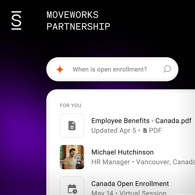
An efficient intranet UI should include advanced search capabilities that allow employees to find specific documents, tools or updates quickly. AI-powered search can enhance this by delivering more accurate and context-relevant results, helping users retrieve information faster and with less effort.
4. Use consistent navigation patterns
Consistency across your intranet’s design helps users build familiarity with the platform. Place navigation elements in the same location across different pages and maintain a clear hierarchy of content. This reduces the learning curve so employees feel more confident using the system.
5. Personalize intranet dashboards
Not all employees need access to the same content, so offering personalized navigation options can help improve efficiency. Tailor navigation menus to reflect the specific needs of different departments or roles so employees aren’t overwhelmed with irrelevant information.
6. Test and gather feedback
Periodically test your intranet’s navigation by observing how employees use the platform. Gather feedback from users to identify pain points or areas for improvement.
Ongoing refinement ensures that your intranet remains user-friendly and aligned with employee needs.
By implementing these intranet navigation best practices, you’ll create a more intuitive and efficient intranet experience for your workforce. Simplifying navigation enhances productivity while fostering greater engagement and satisfaction with the tools they use daily.
Learn more: 17 intranet best practices to raise employee engagement
The long-term benefits of investing in a better intranet UI
Organizations that prioritize ease of intranet navigation and a seamless intranet user interface see higher levels of employee optimism, emotional well-being and work-life balance compared to those with average or below-average intranets.
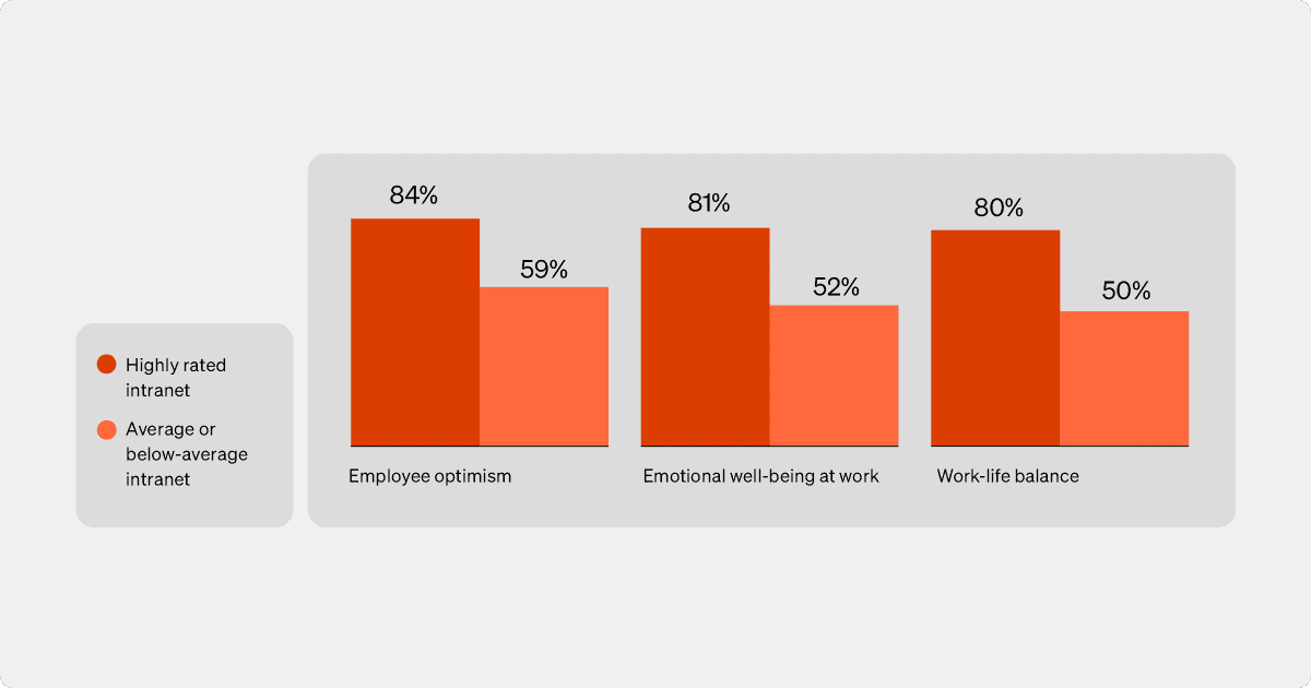
When employees feel supported by their tools, they spend less time struggling with outdated systems and more time focusing on the work that matters. And when they feel empowered by their intranet technology, they are more likely to be engaged and connected to the company mission.
This is why a modern intranet with a consumer-grade interface and intuitive site navigation isn’t a nice-to-have but a must-have. The long-term payoff includes higher productivity, better retention and a more engaged workforce that sees their technology as an asset rather than a hindrance.
How Simpplr can help
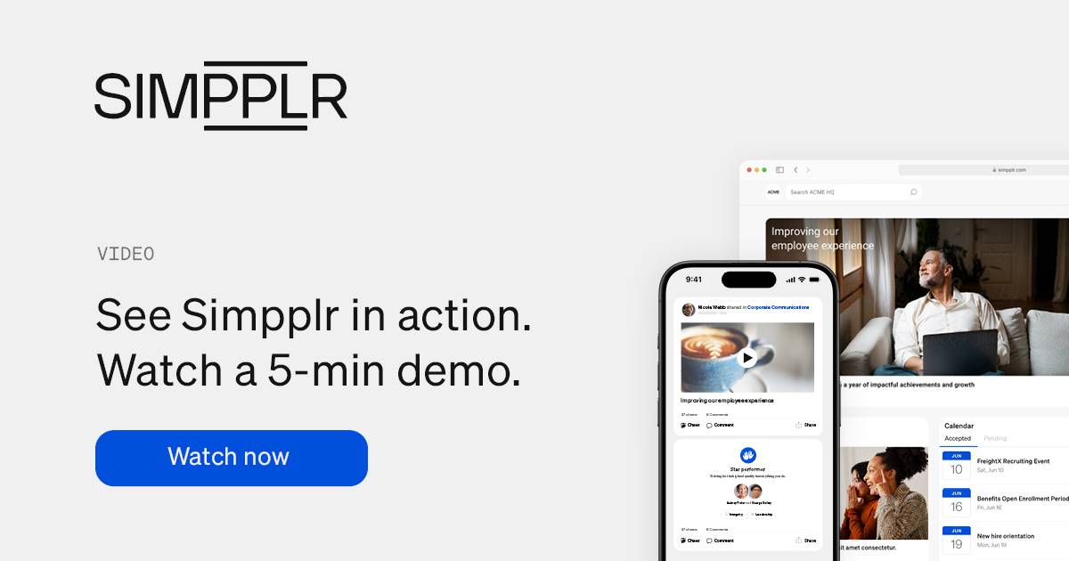
Simpplr is the most comprehensive employee experience platform that addresses the common UI challenges of traditional intranets with an elegant, easy-to-use interface throughout a platform that brings everything employees need to excel into one place — elevating productivity and satisfaction to new heights.
Request a demo today to learn more!
